
Roofing Company Logo Ideas: What Makes One Actually Work

Cary Byrd // Founder of CinchLocal
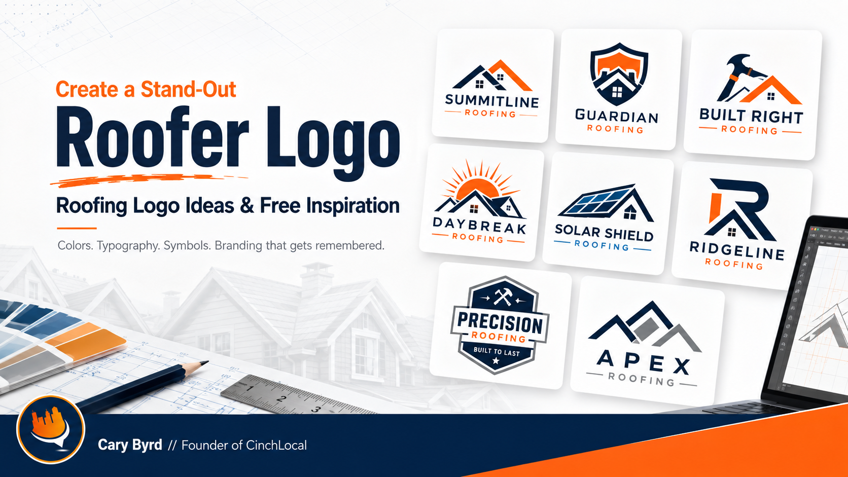
Most roofing logos look the same, and it is not a coincidence. Open any directory or scroll the Google Map Pack in your own city and you will pass two hundred variations of the same house outline with a red roof, usually in blue and orange, usually with a swoosh.
There is nothing wrong with a house and a roof. The problem is when that is the whole idea, because a logo that looks like every competitor cannot do the one job a logo has — being the thing somebody remembers when they need a roofer eight months from now.
Below are the designs worth studying, what actually separates the good ones, and the mistakes that turn up in nearly every DIY attempt.





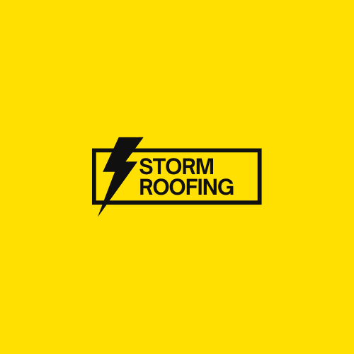
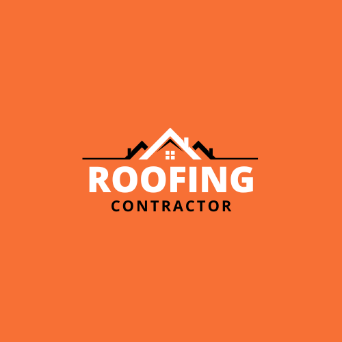
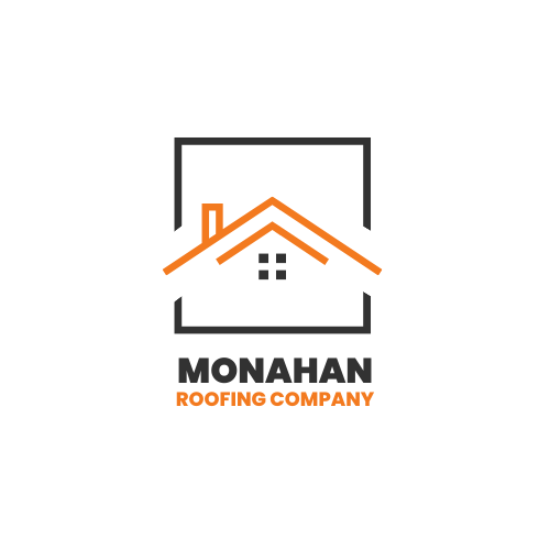
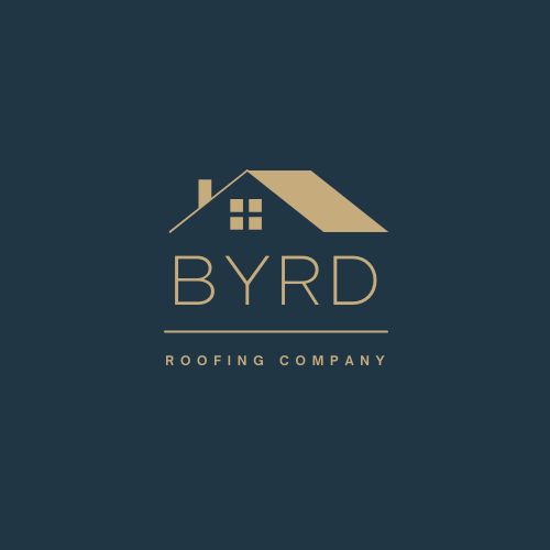
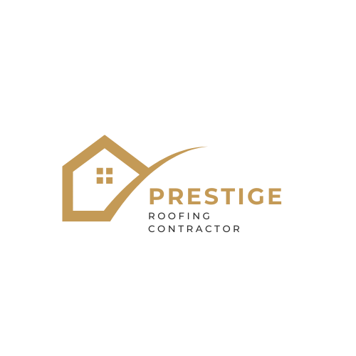
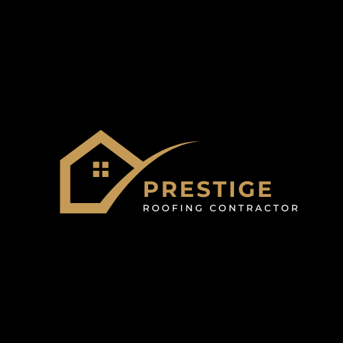
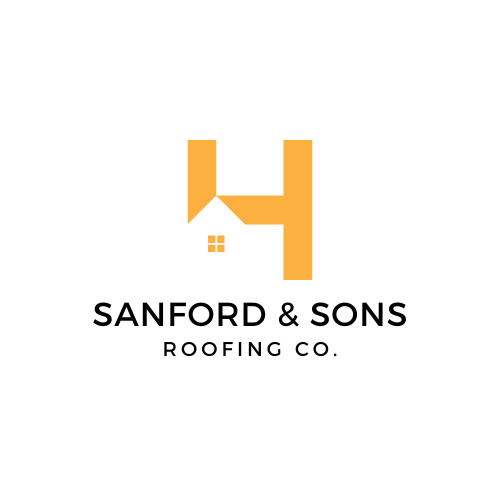
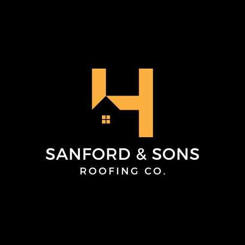
What Separates a Roofing Logo That Works
It survives being small
Your logo will spend most of its life at postage-stamp size — a Google Business Profile thumbnail, a truck door seen from forty feet, a shirt pocket, a favicon. Anything with fine detail, thin lines or a gradient turns to mush.
The test: shrink it to the size of your thumbnail. If you cannot tell what it is, the design has failed regardless of how it looks on screen.
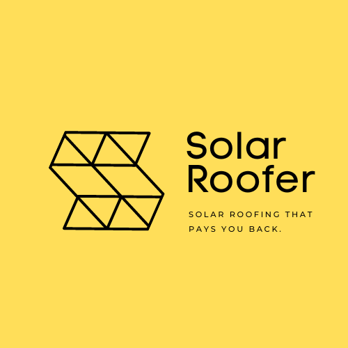
It works in one color
At some point it goes on a vehicle wrap, an embroidered shirt, a yard sign and a stamped invoice. Every one of those has constraints. A logo that only works in full color will get butchered by whoever is producing those things.
The name is legible before the icon is
Roofers get chosen from a list on a phone screen. If the icon is doing the work and the name is small, decorative or squeezed underneath, the reader has to work out who you are. Most will not.
It does not look like the roofer down the road
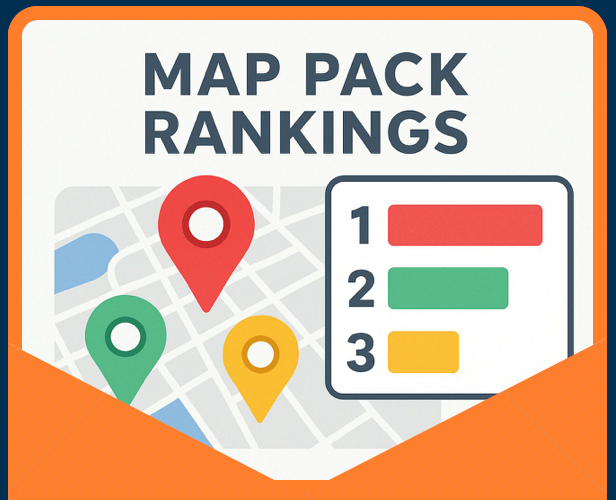
This is the one that gets skipped. Before you commit, search your own city plus “roofing” and look at the three businesses in the Map Pack. If your new logo would sit comfortably among those without standing out, you have designed a competitor's logo.
Do the same for the roofers ranking below them. Those are the companies you will be sitting beside in a directory listing for the next decade.
Color, Type and Icons:
What Roofers Actually Use
Color
Blue and orange dominate the trade, which is exactly why they are worth questioning. Blue reads as trustworthy and orange as energetic, both fine — but shared with every contractor in your market.
Deep green, charcoal, burgundy and black-and-copper all read as professional and almost nobody in roofing uses them. If you want to be recognized, that matters more than picking the theoretically correct color.
Typography
Clean sans-serif for legibility at small sizes. Avoid anything script, distressed or hand-lettered unless your whole brand leans that way — those styles lose their character the moment they get small or embroidered.
Wordmark-only is underrated. Some of the strongest contractor brands are the company name, set properly, with no icon at all.
Icons and symbols
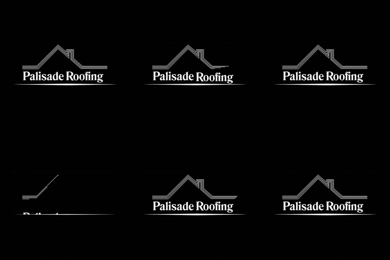
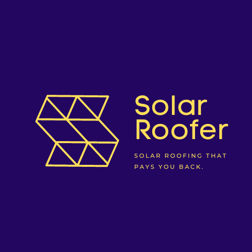
Rooftops, houses, hammers, shingles and sun rays are the common vocabulary. They work, and they are also why everything looks alike.
The more memorable approach is usually something specific to you — the family name, a local landmark, an animal, a shape drawn from your actual roofline. Anything a competitor cannot copy without obviously copying you.
Mistakes That Turn Up in Nearly Every DIY Roofing Logo
Too much detail. Individual shingles, textured clouds, a full house with windows and a door. All of it disappears at small size.
Clip art. A free icon somebody else is also using, usually at a resolution that pixelates on a yard sign.
The name buried under the icon. If the graphic is twice the size of your company name, the priority is backwards.
Too many colors. Two, three at most. Every extra color costs money on printing and embroidery and adds nothing.
Copying the market leader. Understandable and self-defeating. If yours looks like theirs, you are advertising for them.
No one-color version. You will need it. Decide what it looks like rather than letting a sign shop decide for you.
Naming, Taglines and the Rest of the Brand
A logo is one piece. The name sits above it, the tagline sits beside it, and the website is where most people will actually encounter all three.
If you are still choosing a company name, it is worth checking what people in your market actually search before you commit — our roofing keyword list shows the exact terms and volumes, and a name containing a word people search is quietly worth something.
If you are still working on the words, we built a roofing slogan builder that writes taglines with your company name and city in them — the two things most roofer taglines leave out.
And when it comes to where the logo lives, how the website is built matters more than how it looks. A memorable brand on a site nobody can find is an expensive private joke.
That is the part we handle — roofing SEO and the structure underneath it, so the brand you paid for actually gets seen. The Big River case study shows what that looks like with the numbers attached.
A Logo Gets Remembered. A Website Gets Found.
Getting the logo right is worth doing. It is also the part roofers overthink while the thing actually costing them work goes unexamined.
Run the free 40-point website inspection and see what it turns up — services, markets, trust signals, structure. Takes about ten minutes and costs nothing.
Or book a free strategy session and we will go through your site the way we go through a competitor's before taking a client on — services, markets, trust signals, and where your roofing leads are actually going. We work with roofing contractors only, one per market.
Frequently Asked Questions
Want Us to Uncover Hidden 'Footprint Gaps' And Critical Blind Spots That’s Quietly Draining Calls, Jobs, and Profits?
Simply Fill Out The Form Below:
What If You Could Stop Wasting $30K+ a Year on Dead-End Marketing - And Finally Become the Go-To Roofer in Your City?
Other Helpful Articles You Might Enjoy